Style & Fit
There is something different about reaching for a printed scrub top in the morning. Before the shift starts, before the badge goes on, you already feel a little more like yourself.
Patterns are one of the easiest ways to bring personality into a uniform-heavy environment. But wearing them well at work takes a little more intention than reaching for a solid color top. This guide covers how to pair printed scrub tops with confidence, how to navigate dress code considerations, and what to look for when you want a print that holds its look across multiple washes.
Why Printed Scrub Tops Feel Different to Wear
Why Your Outfit Affects Your Shift Before It Even Starts
Color and pattern affect mood in ways that are hard to articulate but easy to feel. Wearing something visually interesting is a small act of self-expression that most healthcare professionals do not get to experience much during a shift.
That distinction matters more than it might seem. When you feel good in what you are wearing, the energy carries. It shows in how you walk into a room, how you carry a conversation with a patient, and how you hold up through hour ten of a twelve-hour shift.
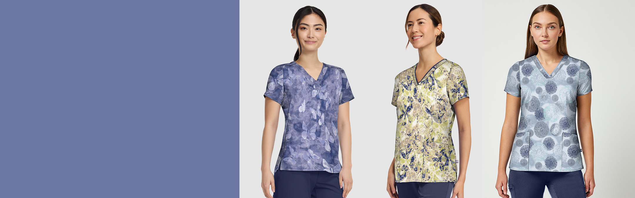
Prints That Hold Up vs. Prints That Overwhelm
Not every print is built the same. A loud, high-contrast pattern in a fast-paced clinical environment can feel like a lot by midshift. A tonal, nature-inspired, or geometric print tends to land differently. It reads as intentional without demanding attention.
The prints that work best in healthcare settings tend to have one unifying quality: they complement the wearer without competing with the environment. Think about the colors in the print first. If they work with the solid bottoms already in your rotation, the rest of the styling comes naturally.
How to Style Printed Scrub Tops With Solid Bottoms
Matching Tones vs. Contrasting Colors
The most reliable approach is to pull one color from the print and match it to your bottom. If the print includes navy, a navy scrub pant grounds the whole look. If it has dusty sage or a warm neutral, those can anchor a clean, cohesive outfit without much effort. This is the same logic that applies in everyday dressing, and it translates directly to choosing scrub colors that work together across your whole rotation.
Contrasting colors can work too, but they require more intention. A warm-toned print against a cool-toned bottom can feel jarring unless the values are similar. When in doubt, pull a neutral from the print: black, pewter, white, or taupe are almost always safe pairings and keep the print as the focal point.

Quest by Healing Hands
$16.50
Price reduced from
$33.00
1 Color


When to Let the Print Lead and When to Pull It Back
If your printed top is the statement piece, keep everything else simple. Solid bottoms, minimal layering, and neutral accessories let the pattern do the talking. This is the approach most healthcare professionals find easiest on a busy day, because it removes decisions from the equation.
When you want a more layered look, a solid zip-front jacket or warm-up worn open over a printed top can frame the pattern rather than cover it. The print becomes a pop of color and personality underneath a clean outer layer. This also solves the practical challenge of moving between warmer and cooler areas of a clinical setting without sacrificing the look.
Navigating Dress Codes With Printed Scrubs
What Most Hospital Dress Codes Actually Say About Prints
Dress codes vary significantly by facility and by role. Many hospitals that assign specific colors to departments still allow prints within those color families, but it is worth checking before you commit to a new top. Some facilities require that prints remain within a certain color range to stay consistent with department identifiers.
The important note here: more than half of healthcare workers have some form of color or uniform assignment from their employer. That does not rule out prints, but it does mean your first filter should be whether the print fits within your assigned palette rather than whether prints are allowed at all.
Prints That Read as Professional in Any Setting
Certain print categories tend to read as professional regardless of setting. Floral prints in muted or tonal colorways, abstract watercolor-style patterns, small geometric repeats, and nature-inspired motifs all tend to sit comfortably in clinical environments. Bold, maximalist prints with high contrast may be better suited to outpatient or pediatric settings where a more expressive look is welcomed.
If you are not sure how a print will land in your specific setting, consider how it photographs. Prints that look clean and polished in a photo tend to read the same way in person. You can also take a cue from how you approach building a scrub wardrobe that works every shift: start with versatile, then add personality.
Finding the Right Printed Scrub Top for Your Shift
Prints That Move With You
A print that catches your eye on a hanger needs to look just as good on your body after eight hours of movement. Scrub fabrics with stretch move with you instead of pulling against you, which keeps the print looking clean and flat all shift.
The same goes for how a fabric handles heat and sweat. A moisture-wicking top pulls sweat away from your skin so you stay dry and comfortable, which means the print looks just as sharp at hour twelve as it did at the start of your shift.


Purple Label by Healing Hands
$17.00
Price reduced from
$34.00
Clearance While Supplies Last
1 Color


Quest by Healing Hands
$26.40
Price reduced from
$33.00
1 Color

How Your Scrub Fit Shapes the Way a Pattern Looks
A well-fitting top makes a print look deliberate. Too tight and the pattern stretches; too loose and it disappears in the fabric. Get the fit right and the print does the rest.
Healing Hands printed scrub tops come in a range of sizes including petite and extended, so you can find what works for your body.
Frequently Asked Questions About Wearing Printed Scrub Tops
Can You Wear Printed Scrub Tops in Most Clinical Settings?
Many clinical environments allow printed scrub tops, particularly in outpatient clinics, pediatric units, and settings where assigned colors are not strictly enforced. The safest approach is to confirm your facility's dress code before purchasing. If your department uses color-coded uniforms, look for prints that incorporate your assigned color prominently.
What Colors Go Best With Printed Scrub Tops?
The simplest pairing strategy is to identify the most dominant or most neutral color in the print and match it to your solid scrub bottom. Black, navy, pewter, and taupe are the most versatile solid bottoms because they appear in or complement almost every print palette. Avoid bottoms that clash with the background color of the print.
How Do Printed Scrubs Hold Up After Multiple Washes?
Print longevity depends on the fabric composition and care routine. Poly-blend fabrics with a tight weave tend to hold color and pattern better than looser constructions. Washing in cold water and tumble drying on low helps preserve the vibrancy of both the print and the base fabric over multiple washes. Always check the care label for the specific top.
Wear What Makes You Feel Like Yourself
Printed scrub tops are one of the most direct ways to bring your personality into a clinical wardrobe. When you start with a print that fits the color palette you already wear, pairs with the solid scrub pants you already own, and holds up through a full shift, the styling part takes care of itself.
Browse Healing Hands printed scrub tops to find patterns that work for your rotation and your setting.